Friday, 11 May 2012

Evaluation

There are four questions which need to be answered for my evaluation.  These are:

  1. In what ways does your media product use, develop or challenge forms and conventions of real media products?
  2. How effective is the combination of your main product and ancillary texts?
  3. What have you learned from your audience feedback?
  4. How did you use new media technologies in the construction and research, planning and evaluation stages?
1. I looked at a variety of different inspirational texts for my CD and magazine advert.  Initially I had planned to use a mostly black and grey colour scheme, as this is conventional of the genre.  However, I soon realized that it was too plain and didn't look detailed enough.  I then changed the colour scheme so that it was pink and yellow, colours inspired by a Sex Pistol CD, which gives the CD a 'retro' feel and perhaps hints that the music is in the same vein as bands from the 70s and 80s- a time which many people see as the era of 'good' music, or music that is better than today's.  This is actually a very common idea held by many people interested in music.  My music video fits the genre quite nicely with the setting being Whitby Abbey, linking it to the gothic theme which runs throughout.  Aside from the choice of setting, I used different camera angles and shot types to show the scenery and make it seem imposing if filmed from a low angle.  As for the magazine advert, I used a more-or-less plain design, to make it stand out well and not 'overpower' the reader with too much information or text.  The black colours are probably typical conventions of the genre.  The products don't particularly challenge the genre too much.

2.  My main product works very well with my other two products.  All of them use conventions of the genre and have a similar theme.  The main product is supposed to be a music video for a song featured on the CD, which was advertised in the magazine advert.  The consistency of the genre is what I feel is the main link between them all and what allows them to work well together.

3.  For my audience feedback I sent out a questionnare, asking some questions to get an idea of the demographics of my target audience.  The questions were as follows:

- What is your age?
- What genre of music do you listen to?
- Would you buy this CD?
- What interests do you have, if any?

From my results I learned that all of my target audience was under 20, and listened to different genres of music, with the most common being punk, darkwave, deathrock, gothic, metal, and new wave.  Music turned out to be a very popular interest, and some of the people who answered even read music magazines, which would work in favour of my CD as it's being featured in a magazine advert.  This would draw in my target audience and boost sales.  Everyone said that they would buy the CD.

4.  I made use of a range of media technologies and programs in designing my product.  Youtube was useful for me to find music and any inspirational music videos, while I used Google to search for inspirational CD covers and magazine adverts.  For the uploading of any information regarding my product I used Blogger to make a blog, which makes my project very interactive and modern.  Aside from these, I found Photoshop to be probably the most useful program, as it allowed me to edit images for the CD and the magazine advert, in order to make them interesting and experiment with different art styles to make them aesthetically pleasing.

Shots for music video

As I chose to do a music video, I began to film some shots from different angles with the camera.  These brief clips were meant to be interjected into parts of the music video, with the main action taking place inside of a building.  However, as time went on, my focus was on other work, as well as finishing off my A/S coursework.  When I came onto this project, I focused first on the CD and the magazine advert.  Unfortunately, I did not have time to finish the rest of the video.  I had ideas, as detailed in the storyboard, but it became increasingly hard for me to film- especially seeing as I didn't have any group members apart from myself.  What I was left with were those few clips which would form a part of the video.  The original intention was for the action to temporarily cut away between the verses and the chorus, and to show some of the setting I had filmed.  The different camera angles and shot types (such as opening shots to set the scene, close ups to show detail, low angles to make the scenery seem more 'imposing' or majestic etc.) were also a sort of experiment with different shot types and camera angles.  If I was to do this coursework again, or if I had longer, I would have finished the video.

The song I intended to use was the song 'In the Night' by Bauhaus, found here:

http://www.youtube.com/watch?v=tcxFXNLg3KQ


What little there is of my video can be found here:

My magazine advert

My final magazine advert was designed to be more along the lines of 'simple, but eye-catching'.  It uses a black and white colour scheme, which makes it rather plain and not very elaborate.  I intended for it to be this way because I believe that anything too complex would distract the reader and wouldn't be very aesthetically pleasing.  Context is also important.  Since it appears in a magazine, the advert will need to be appealing to the reader in order to persuade them to buy the CD.  I used an image of the CD cover to show the actual product, and then showed some information- the kind that would usually be shown in a magazine advert for a CD.  To make it seem more authentic, I put a quote from a music magazine at the bottom.  Quotes from magazines are important in the music industry as they help advertise CDs and give them credibility.  The website address, the mention of digital download etc. also demonstrate awareness of different types of media available especially in the modern age with its modern technology, something that I think would make the CD appear more 'modern' in addition to its 'retro' feel.


My final CD

The CD I have designed is very 80s punk/goth influenced, well-suited to the genre and thus very conventional.  The use of colour is important, with a heavy usage of neon glow and the colours black, pink, and yellow to create the image and the CD design.  This use of colour makes the CD feel more 'authentic' and also makes it aesthetically pleasing, giving the music connotations of being aurally pleasing and interesting.  This I believe would attract people to it.  I experimented with several idea beforehand, trying a mostly black and grey colour scheme to be as conventional as possible within the genre.  However, I found this be too dull and not 'authentic' enough, and so I changed the colour scheme and made the font more plain and bold in order to stand out clearly and be memorable to the reader.  The pink and yellow colour scheme was also somewhat inspired by cover art for the Sex Pistols.  I kept to the same colour scheme and theme throughout the CD in order to remain consistent.


Tuesday, 18 October 2011

Storyboard

This is the first part of my storyboard.  It shows the opening scenes of the music video, which set the mood and tone for the rest of it, and also give the viewer a good idea of the plot.

Setting/Location Ideas

I have a few setting and location ideas.  These places will be representative or in some way symbolic to the scene they are a part of.

The first example of a location will just be a room.  The lighting should be dim.  I could easily film this in a room in college, as it will just need to be a room with large windows in the background and perhaps some trees outside.  These should be easy to find in the college.  The room setting should play only a very small part in the video, as it will be the location for the parts that occur in the present, with the character remembering back to the past.  There will not be a whole lot needed here, and weather won't really be an issue.

The next example of a location will be Whitby Abbey.

I will be able to get some shots at Whitby, which I will incorporate into my video.  The shots at Whitby will be part of the memory/flashback aspect of the music video.  I hope to get the abbey from a variety of different camera angles.

The final location will be some location outside with lots of trees.  I could either film outside of college in the grounds as there are plenty of areas there which should be quiet and free, or in the park down the street.  There should be lots of autumn leaves falling, and the trees should be almost bare.  This too will form a part of the memory/flashback aspect of the video.

Though I will film three locations, in the actual video I will have only have two settings: indoors and outdoors.  This is because I will combine the trees footage with the abbey footage in an attempt to make them into one setting.  I will have a few establishing shots of the abbey to set the scene and the gothic feel and mood.  I will then combine this footage with the main footage of the trees, in an effort to make them seem like the same location or one location.  A change in weather wouldn't really matter as it would add a possibly supernatural/mystical dimension to the music video.

Costume Ideas

I have been putting together ideas for costume in the video.  I have settled on an idea of two outfits, which I will wear at different times in the video.

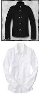
The first costume will be for the character in the present day.  He is wearing a costume which includes hair tyed into a poneytail, a white shirt, and a black hook jacket on top.  This costume will be worn throughout the video when it is set in the present.  It is supposed to represent a sort of aristocratic 'period' kind of look, which will also represent the kind of 'thoughtful' persona the character will have during the present.

Shown in the image above is the white shirt which will be worn underneath the black hook jacket pictured above.  This costume might have connotations of education or wealth which will further flesh out the kind of character he is supposed to be.


The second costume will be worn during the character's memories and flashbacks.  It will consist of a black t-shirt, a black leather jacket, a black spiked belt, black jeans, and sometimes black sunglasses.  The character's hair will also not be tied back but will be worn as normal, with no poneytail.

The image above shows the black leather jacket, black jeans and black spiked belt worn by the character during these moments, which will happen in the flashback scenes.  This costume idea is a lot more 'modern' than the other one, but still has the same gothic connotations the first has, tying them both together.  As opposed to the first costume idea, which will show the character's more 'thoughtful' side, this second costume idea is meant to portray his more 'active' side.  Indeed, most of the 'action' or 'event' based shots will happen in the flashbacks and memories.